- Products
-
Dining
-
Lounge
-
Bedroom
-
Outdoor
-
Brands
-
- Collections
- Projects
- Resources
- Customisation
- About
- Contact


The Soothing Power of Colour
Everyone should be comfortable in their environments. It is for this reason that you have to pay close attention to the colours used in aged care interior design. Whether you’re at home or at an aged care facility, the colours you are surrounded by have an impact on your mood and overall well-being.
Here’s three of the most popular current approaches in aged care interior design right now:
Looking at the Pantone colour of the year for 2018 a dramatically provocative and thoughtful purple shade, PANTONE Ultra Violet communicates originality, ingenuity, and visionary thinking that points us toward the future. In Interiors, Ultra Violet can transform a room into one of extraordinary self-expression, adding spice and brightness to a space that can often be dull and lifeless.
Choosing Colours

Colours are commonly broken into categories: warm and cool. The warm tones include red, yellow, and orange. They have the tendency to add energy to a space as well as to the occupants. The cool tones include blue, purple, and green. These colours are likely to relax the occupants and create a tranquil, peaceful environment.
Becoming older often leads to loneliness and depression. You need to keep this in mind and decorate with colours that are warm and provide a sense of security. The colours chosen should boost interest in one’s environment, which has the potential to keep cognitive function alive and well.


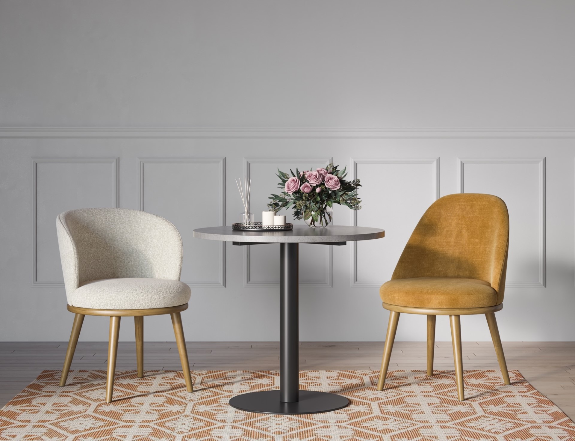
Many older people are drawn to pastels. The vitality of the hue is not as important as eyesight problems often impair colour and how it is viewed. As such, it’s better to go with softer shades of the warm colours. Warm tans, terra cottas, peaches, apricots, and more are all purposeful. These should be placed in rooms where you want seniors to be more active.
Colours such as soft blues and lavenders are best in areas of calm and quiet such as bedrooms, quiet rooms where seniors might go to read.
Some studies have gone as far as saying that aging care centres that use soft pink and beige contrasted with soft blues and greens have a peaceful and soothing effect on those who are residents.
Creating the Overall Theme
Once you decide on the colour schemes you want to use, it’s important to look at how you’re going to use the contrast of hue as well as the contrast of cold and warm throughout the different rooms. Understand the colour psychology so you know how they are going to impact the people who are around.
When you choose the colours based on their psychology and soften the hues, you are more likely to keep the seniors inside the care centre calmer and happier because they will feel safe and comfortable within their environment. Even as you decorate for an individual senior, it’s important to remember the various colours and what they mean so you know how to motivate and relax them.
New Zealand distributors of Domus Ventures Products | A division of Archer Concepts
© Archer Care - all rights reserved | Site by Online Designs